Course Gallery
Week 1

Ex. image 1: Coastline
Description...

Ex. image 2: Night vision-type image
Description...
Week 2

Static demo image: Job changes in 3 neighborhoods (2011-2021)
Example static image of how types of jobs (blue-collar vs. white-collar) have changed in 3 neighborhoods between 2011 and 2021

Interactive demo image: Job changes in 3 neighborhoods (2011-2021)
Example interactive image of how types of jobs (blue-collar vs. white-collar) have changed in 3 neighborhoods between 2011 and 2021
Static demo image: Property changes in 3 neighborhoods (2011-2021)
Example static image of how property types (rental vs. owner-occupied) have changed in 3 neighborhoods between 2011 and 2021

Interactive demo image: Property changes in 3 neighborhoods (2011-2021)
Example interactive image of how property types (rental vs. owner-occupied) have changed in 3 neighborhoods between 2011 and 2021
Week 3
💻 Lab 2

Part A - Create a course environment
Description...

Part B - Register a Jupyter kernel and launch JupyterLab
Description...

Part C - Automated sanity-check (includes NumPy/Pandas practice)
Description...

Part D - Reproducibility: export your environment
Description...
📖 Lab 2 Reflections
Short reflection
What worked / failed
This largely worked, the biggest challenge at first was that I have an Intel processor in my Mac, and the full Anaconda install is only available for Macs with Silicon chips.
How I fixed it
I had to install the command-line version from the Anaconda site, since that is the only one still able to be used for Macs with Intel processors.
Why environments matter for reproducible geovis work
Virtual environments matter because they allow for adaptation to changes in different packages, and help ensure they all work together if some have been updated.
Week 4
💻 Lab 3

S1 EarthExplorer
Search Criteria page showing AOI + date range.

S2 EarthExplorer
Data Sets page showing the datasets selected.

S3 EarthExplorer
Results list showing scene selected (including cloud cover/preview).

S4 EarthExplorer
Download list showing file downloaded

S5 GEE access
Code Editor opened successfully

S6 JupyterLab
geemap map showing ROI + an imagery layer (e.g., Sentinel-2 RGB).

S7 JupyterLab
NDVI layer visible with colorbar/legend.

S8 JupyterLab
NDVI data export to Google Drive
Week 5

1. Imports + package versions (GeoPandas, rasterio)
import geopandas as gpdstudy = gpd.read_file("3homes.geojson") # circles for 3 homes
# study = gpd.read_file('ne_110m_land.geojson', engine='pyogrio')study.plot()vec = gpd.read_file("polygon_Concord_neighborhood_2017-2021.json") # block groupsvec.plot()print("Study CRS:", study.crs)
print("Study bounds:", study.total_bounds)
print("Vector CRS:", vec.crs)
print("Vector bounds:", vec.total_bounds)
print(vec.head())WORK_EPSG = "EPSG:32617" # example only
study_m = study.to_crs(WORK_EPSG)
vec_m = vec.to_crs(WORK_EPSG)study_m.plot()vec_m.plot()import geopandas as gpd
vec_clip = gpd.clip(vec_m, study_m)
if vec_clip.geom_type.isin(["Polygon", "MultiPolygon"]).any():
vec_clip["area_m2"] = vec_clip.area
print("Total area (km2):", vec_clip["area_m2"].sum() / 1e6)
# # Export
vec_clip.to_file(
"/Users/bhoconnor/Documents/GitHub/Data/Lab4/geovistest.gpkg",
layer="vector_clipped",
driver="GPKG",
)vec_clip.plot()import matplotlib.pyplot as plt
ax = study_m.plot(facecolor="none", edgecolor="black", linewidth=2, figsize=(8, 6))
vec_clip.plot(ax=ax, linewidth=0.8, alpha=0.8)
ax.set_title("Study area + clipped vector")
ax.set_axis_off()
plt.show()import numpy as np
import rasterio
raster_path = "raster_concord.TIF" # my Concord file
with rasterio.open(raster_path) as src:
print("CRS:", src.crs)
print("Bounds:", src.bounds)
print("Transform:", src.transform)
print("Resolution:", (src.transform.a, -src.transform.e))
print("Nodata:", src.nodata)
print("Count:", src.count, "dtype:", src.dtypes)import matplotlib.pyplot as plt
with rasterio.open(raster_path) as src:
band1 = src.read(1)
nod = src.nodata
data = np.where(band1 == nod, np.nan, band1) if nod is not None else band1
print("min/mean/max:", np.nanmin(data), np.nanmean(data), np.nanmax(data))
plt.figure(figsize=(8, 6))
plt.imshow(band1)
plt.title("Raster preview (band 1)")
plt.axis("off")
plt.show()from rasterio.mask import mask
with rasterio.open(raster_path) as src:
study_r = study.to_crs(src.crs)
shapes = [g.__geo_interface__ for g in study_r.geometry]
out_img, out_transform = mask(src, shapes, crop=True)
out_meta = src.meta.copy()
out_meta.update(
{
"height": out_img.shape[1],
"width": out_img.shape[2],
"transform": out_transform,
}
)
clipped_path = "raster_clipped.tif"
with rasterio.open(clipped_path, "w", **out_meta) as dst:
dst.write(out_img)
print("Saved:", clipped_path)from shapely.geometry import Point
import random
import geopandas as gpd
import rasterio
with rasterio.open("raster_clipped.tif") as src:
crs_r = src.crs
study_r = study.to_crs(crs_r)
poly = study_r.geometry.union_all()
N = 50
minx, miny, maxx, maxy = poly.bounds
pts_list = []
while len(pts_list) < N:
x = random.uniform(minx, maxx)
y = random.uniform(miny, maxy)
p = Point(x, y)
if poly.contains(p): pts_list.append(p)
pts = gpd.GeoDataFrame({"id": range(1, N+1)}, geometry=pts_list, crs=crs_r)import rasterio
with rasterio.open("raster_clipped.tif") as src:
coords = [(g.x, g.y) for g in pts.geometry]
vals = [v[0] for v in src.sample(coords)]
pts["value"] = vals
print(pts.head())
pts.to_file("points_sampled.gpkg", layer="points_sampled",
driver="GPKG")import matplotlib.pyplot as plt
ax = study_r.plot(facecolor="none", edgecolor="black", linewidth=2,
figsize=(8,6))
pts.plot(ax=ax, column="value", legend=True, markersize=25)
ax.set_title("Sampled points (value)")
ax.set_axis_off()
plt.show()
2. Vector inspection output: CRS + total_bounds + a preview of columns/head()

3. Map preview: study boundary + clipped vector layer

4. Raster metadata output: CRS + transform + bounds + nodata + resolution

5. Raster preview plot (full raster)

6. Masked/clipped raster preview plot + nodata-aware min/mean/max

7. Points sampling output: first 5 rows showing sampled values

8. Final check: map of sampled points (colored) on top of the study boundary

9. File explorer screenshot showing outputs / folder contains exported files

Better map example
A map that was done fairly well of Detroit, even if I have questions about this way of delineating class by Richard Florida (from here).


Mid-level quality map example
This was a complicated, but at the same time interesting map example, if you take the time to read it in some more depth (from here).
+ Add New Week
Week 6
💻 Lab 5

1a. Successful imports + package versions (GeoPandas, matplotlib, mapclassify; cartogram if used)
Description...
import geopandas as gpd
import mapclassify
import matplotlib
import matplotlib.pyplot as plt
import numpy as np
import pandas as pd
!pip install matplotlib-scalebar

print("geopandas:", gpd.__version__)
print("pandas:", pd.__version__)
print("numpy:", np.__version__)
print("matplotlib:", matplotlib.__version__)
print("mapclassify:", mapclassify.__version__)import geodatasets
import geopandas as gpd
gdf = gpd.read_file("Data-v4-null_removed/1-home-v4.gpkg") # 1-home with aggregated prop values
print("CRS:", gdf.crs)
print("Bounds:", gdf.total_bounds)
print("Columns:", list(gdf.columns))
print(gdf.head())WORK_EPSG = "EPSG:32617"
gdf_m = gdf.to_crs(WORK_EPSG)gdf.total_boundsVAR = "Assessed_Median"
gdf_m[VAR] = pd.to_numeric(gdf_m[VAR], errors="coerce")
print("Missing values:", gdf_m[VAR].isna().sum())
print(gdf_m[VAR].describe())import matplotlib.pyplot as plt
ax = gdf_m.plot(
column=VAR,
scheme="Quantiles",
k=5,
cmap="Blues",
linewidth=0.3,
edgecolor="white",
legend=True,
legend_kwds={
"loc": "lower left", # Moves to lower left
"bbox_to_anchor": (0.05, -0.02), # Moves it just outside the right edge
},
figsize=(9, 7),
)
ax.set_title(f"Choropleth: Property Values ({VAR}) -- Quantiles, k=5")
ax.set_axis_off()
plt.show()import contextily as cx
import matplotlib.pyplot as plt
# 1. Convert to Web Mercator (EPSG 3857) for Contextily basemaps
gdf_web = gdf_m.to_crs(epsg=3857)
# 2. Plot using the projected GeoDataFrame (gdf_web instead of gdf_m)
ax = gdf_web.plot(
column=VAR,
scheme="Quantiles",
k=5,
cmap="Oranges",
linewidth=0.3,
edgecolor="white",
legend=True,
legend_kwds={
"loc": "lower left", # Moves to lower left
"bbox_to_anchor": (0.05, -0.001), # Moves it just outside the right edge
},
figsize=(15, 7),
)
# --- ZOOM OUT LOGIC ---
# Get the total bounding box of your data
minx, miny, maxx, maxy = gdf_web.total_bounds
# Calculate the width and height of the bounding box
x_range = maxx - minx
y_range = maxy - miny
# Define a zoom out factor (e.g., 0.5 adds 50% more space on all sides)
# Increase this number to zoom out more, decrease to zoom in
zoom_factor = 0.5
# Set the new expanded axis limits
ax.set_xlim(minx - (x_range * zoom_factor), maxx + (x_range * zoom_factor))
ax.set_ylim(miny - (y_range * zoom_factor), maxy + (y_range * zoom_factor))
# ----------------------
# 3. Add the basemap
cx.add_basemap(ax, source=cx.providers.CartoDB.Positron)
ax.set_title(f"Choropleth + basemap: Property Values ({VAR}) -- Quantiles, k=5")
ax.set_axis_off()
# Show the map
plt.show()gdf_m["ratio_white"] = gdf_m["white_aloneE"] / gdf_m["total_estimateE"]X = "ratio_white" # <-- change
Y = "Assessed_Median" # <-- change
N = 3 # number of bins per variable (3 -> 3x3)
gdf_m[X] = pd.to_numeric(gdf_m[X], errors="coerce")
gdf_m[Y] = pd.to_numeric(gdf_m[Y], errors="coerce")
# Quantile bins (0..N-1). duplicates='drop' avoids errors if many ties.
gdf_m["x_bin"] = pd.qcut(gdf_m[X], N, labels=False, duplicates="drop")
gdf_m["y_bin"] = pd.qcut(gdf_m[Y], N, labels=False, duplicates="drop")
# Combine bins into one class ID (row-major)
gdf_m["bi_class"] = gdf_m["y_bin"] * N + gdf_m["x_bin"]# This will show you the exact range for each bin
x_bins = pd.qcut(gdf_m[X], N, duplicates="drop")
y_bins = pd.qcut(gdf_m[Y], N, duplicates="drop")
print(f"X-Axis ({X}) Ranges:")
print(x_bins.value_counts().sort_index())
print(f"\nY-Axis ({Y}) Ranges:")
print(y_bins.value_counts().sort_index())import contextily as cx
import matplotlib.pyplot as plt
from matplotlib_scalebar.scalebar import ScaleBar
# 1. High DPI for crisp labels
fig, ax = plt.subplots(figsize=(15, 7), dpi=200)
# 2. Plot with Alpha
# alpha=0.5 makes the colors 50% transparent
gdf_m.to_crs(epsg=3857).plot(
ax=ax,
color=gdf_m["bi_color"],
linewidth=0.3,
edgecolor="white",
alpha=0.5 # <--- ADJUST TRANSPARENCY HERE
)
# --- 3. Add High-Res Basemap ---
# Using CartoDB Positron for a clean look, but muting the auto-attribution
import contextily as cx
cx.add_basemap(
ax,
source=cx.providers.CartoDB.Positron,
zoom="auto",
interpolation='bilinear',
attribution="" # <--- This hides the default text that was cutting off
)
# --- Manually place the Attribution ---
# We move it 5% right (0.05) and 2% up (0.02)
ax.text(0.05, 0.02, "© OpenStreetMap contributors, © CARTO",
transform=ax.transAxes,
fontsize=8,
va='bottom',
ha='left',
bbox=dict(facecolor='white', alpha=0.5, edgecolor='none', pad=1))
# --- 4. Moderate Zoom Logic ---
minx, miny, maxx, maxy = gdf_m.to_crs(epsg=3857).total_bounds
dx, dy = maxx - minx, maxy - miny
padding = 0.25 # <--- Halfway between the old 0.5 and the tight 0.1
ax.set_xlim(minx - padding * dx, maxx + padding * dx)
ax.set_ylim(miny - padding * dy, maxy + padding * dy)
# --- 5. MULTI-LINE STYLED TITLE ---
# Main Bold Line
plt.title("Neighborhood 1: Home",
fontweight='bold',
fontsize=18,
y=1.06) # Pushed up slightly more to make room for the second line
# Subtitle (Italicized, non-bold, smaller)
# We use ax.text to place it exactly between the main title and the map
ax.text(0.5, 1.02, "Bivariate Analysis: Home Value vs. Race",
transform=ax.transAxes,
ha='center',
va='bottom',
fontsize=14,
style='italic')
# --- 6. SCALE BAR ---
# Keeping your working settings
from matplotlib_scalebar.scalebar import ScaleBar
scalebar = ScaleBar(
dx=1,
location='lower right',
box_alpha=0.3,
border_pad=3.0,
font_properties={'size': 9},
label_formatter=lambda value, unit: f"{value/1609.34:.1f} mi"
)
ax.add_artist(scalebar)
# --- 7. NORTH ARROW ---
# Adjusted for 0.25 padding to keep it in the top-left map area
ax.annotate('',
xy=(0.08, 0.92),
xytext=(0.08, 0.85),
arrowprops=dict(facecolor='black', width=3, headwidth=10),
xycoords='axes fraction')
ax.text(0.08, 0.93, 'N',
transform=ax.transAxes,
ha='center', va='bottom',
fontsize=16, fontweight='bold')
# ----------------------------------------- #
ax.set_axis_off()
plt.show()# REPLACED THIS CODE W/THE NEXT BLOCK
# from matplotlib.patches import Rectangle
# fig, ax = plt.subplots(figsize=(4, 4))
# for y in range(N):
# for x in range(N):
# idx = y * N + x
# ax.add_patch(Rectangle((x, y), 1, 1, facecolor=palette[idx], edgecolor="none"))
# ax.set_xlim(0, N)
# ax.set_ylim(0, N)
# ax.set_aspect("equal")
# # Minimal labeling (edit these to match your variables)
# ax.set_xticks([0.5, 1.5, 2.5])
# ax.set_yticks([0.5, 1.5, 2.5])
# ax.set_xticklabels(["Low", "Med", "High"])
# ax.set_yticklabels(["Low", "Med", "High"])
# ax.set_xlabel(X + " →")
# ax.set_ylabel(Y + " ↑")
# # Clean look
# for spine in ax.spines.values():
# spine.set_visible(False)
# plt.title("Bivariate legend (3x3)")
# plt.show()from matplotlib.patches import Rectangle
# 1. Extract the actual bin edges for labeling
# 'retbins=True' captures the numeric boundaries from your data
x_bins = pd.qcut(gdf_m[X], N, duplicates="drop", retbins=True)[1]
y_bins = pd.qcut(gdf_m[Y], N, duplicates="drop", retbins=True)[1]
# 2. Create the labels (Formatted for readability)
# percentage white
# {val*100:.0f} multiplies the decimal (0.37) by 100 to get a whole number (37)
x_labels = [f"{x_bins[i]*100:.0f}-{x_bins[i+1]*100:.0f}%" for i in range(N)]
# median value
y_labels = [f"${y_bins[i]/1000:.0f}k -\n${y_bins[i+1]/1000:.0f}k" for i in range(N)]
# 3. Build the 3x3 Legend Plot
fig, ax = plt.subplots(figsize=(4, 4))
for y in range(N):
for x in range(N):
idx = y * N + x
ax.add_patch(Rectangle((x, y), 1, 1, facecolor=palette[idx], edgecolor="none"))
ax.set_xlim(0, N)
ax.set_ylim(0, N)
ax.set_aspect("equal")
# Apply the dynamic labels instead of "Low, Med, High"
ax.set_xticks([0.5, 1.5, 2.5])
ax.set_yticks([0.5, 1.5, 2.5])
ax.set_xticklabels(x_labels, fontsize=9)
ax.set_yticklabels(y_labels, fontsize=9)
ax.set_xlabel("White Population Share (%) →", fontweight='bold')
ax.set_ylabel("Median Home Value →", fontweight='bold')
# Clean up spines
for spine in ax.spines.values():
spine.set_visible(False)
plt.title("Legend - Bivariate Ranges", fontweight='bold')
plt.tight_layout()
plt.show()gdf_m['poc'] = gdf_m["total_estimateE"] - gdf_m["white_aloneE"]print(gdf_m['poc'])CART_FIELD = "poc" # <-- people of color (total pop. - white pop.)
gdf_m[CART_FIELD] = pd.to_numeric(gdf_m[CART_FIELD], errors="coerce")
gdf_m = gdf_m.dropna(subset=[CART_FIELD]).copy()
# Cartograms require positive values
gdf_m = gdf_m[gdf_m[CART_FIELD] > 0].copy()
print(gdf_m[CART_FIELD].describe())# Requires: pip install cartogram
import cartogram
import matplotlib.pyplot as plt
c = cartogram.Cartogram(
gdf_m,
CART_FIELD,
max_iterations=99, # try: 30, 60, 99 (Gemini: "this is number of times algorithm "pushes" & "pulls" boundaries--more usually=more extreme distortion to meet data targets."
max_average_error=0.01 # try: 0.10 (faster) -> 0.02 (more accurate) (Gemini: "keeps distorting until difference between "intended area" & "actual area" is only % designated; setting to lower # (like .01) forces more dramatic size changes to achieve high precision")
)
print("Average residual area error:", c.average_error) # Gemini: c.average_error is "average difference between target area (what data says size should be) & actual area (what algorithm managed to achieve)"
ax = c.plot(
column=CART_FIELD,
scheme="Quantiles",
k=5,
cmap="Reds",
linewidth=0.3,
edgecolor="white",
legend=True,
figsize=(9, 7),
)
ax.set_title(f"Contiguous cartogram by {CART_FIELD}")
ax.set_axis_off()
plt.show()
# Optional export
c.to_file("outputs/cartogram.gpkg", layer="cartogram", driver="GPKG")import geopandas as gpd
import pandas as pd
import matplotlib.pyplot as plt
# ---------------------------------------------------------
# Setup: Define file paths and variables
# ---------------------------------------------------------
bg_file = "2013+2021-concord_block_grp_data.gpkg"
# Dictionary to loop through the 3 sets of files
file_sets = {
"home": {
"circle": "1-home.gpkg",
"data": "1-data-home.gpkg",
"output": "1-final-home_bg_aggregated.gpkg"
},
"lowest": {
"circle": "2-lowest.gpkg",
"data": "2-data-lowest.gpkg",
"output": "2-final-lowest_bg_aggregated.gpkg"
},
"highest": {
"circle": "3-highest.gpkg",
"data": "3-data-highest.gpkg",
"output": "3-final-highest_bg_aggregated.gpkg"
}
}
# Load the main block group dataset
print("Loading Census Block Groups...")
block_groups = gpd.read_file(bg_file)
# We will use the block group's CRS as our standard target CRS
target_crs = block_groups.crs
# ---------------------------------------------------------
# Processing Loop for each subset (Home, Lowest, Highest)
# ---------------------------------------------------------
for name, paths in file_sets.items():
print(f"\n{'='*40}")
print(f"PROCESSING SET: {name.upper()}")
print(f"{'='*40}")
# Load the circle and property data
circle = gpd.read_file(paths["circle"]).to_crs(target_crs)
prop_data = gpd.read_file(paths["data"]).to_crs(target_crs)
# ==========================================
# STEP 1: Clip block groups using the circle
# ==========================================
print(f"Step 1: Clipping block groups for '{name}'...")
clipped_bg = gpd.clip(block_groups, circle)
# Reset index to ensure clean spatial joins later
clipped_bg = clipped_bg.reset_index(drop=True)
# ==========================================
# STEP 2: Convert property polygons to points
# ==========================================
print(f"Step 2: Converting property polygons to points...")
prop_points = prop_data.copy()
# Best practice: project to a planar CRS (like EPSG:3857) to calculate accurate centroids,
# then project back to the target CRS
prop_points = prop_points.to_crs(epsg=3857)
prop_points.geometry = prop_points.geometry.centroid
prop_points = prop_points.to_crs(target_crs)
# Optional Plotting: Show intermediate results for visual verification
fig, ax = plt.subplots(figsize=(8, 8))
clipped_bg.plot(ax=ax, facecolor='none', edgecolor='blue', linewidth=1.5, label='Clipped Block Groups')
circle.plot(ax=ax, facecolor='none', edgecolor='red', linestyle='--', linewidth=2, label='Clip Circle')
prop_points.plot(ax=ax, color='green', markersize=5, alpha=0.5, label='Property Points')
ax.set_title(f"Intermediate Results: {name.capitalize()}")
plt.legend()
plt.show()
# ==========================================
# STEP 3: Spatial Join & Aggregation
# ==========================================
print(f"Step 3: Spatial join and calculating mean/median...")
# Spatial join: keep points that intersect the clipped block groups
# 'index_right' will contain the index of the clipped_bg that the point falls into
joined_data = gpd.sjoin(prop_points, clipped_bg, how="inner", predicate="intersects")
# Group by the block group index and calculate mean and median
if 'AssessedConverted' in joined_data.columns:
agg_stats = joined_data.groupby('index_right')['AssessedConverted'].agg(['mean', 'median']).reset_index()
agg_stats.rename(columns={'mean': 'Assessed_Mean', 'median': 'Assessed_Median'}, inplace=True)
# Merge the aggregated stats back onto the clipped block group geometries
final_bg = clipped_bg.merge(agg_stats, left_index=True, right_on='index_right', how='left')
# Clean up the extra 'index_right' column
final_bg.drop(columns=['index_right'], inplace=True)
# Fill NaN values with 0 for block groups that had no properties in them
final_bg['Assessed_Mean'] = final_bg['Assessed_Mean'].fillna(0)
final_bg['Assessed_Median'] = final_bg['Assessed_Median'].fillna(0)
else:
print(f"WARNING: 'AssessedConverted' column not found in {paths['data']}.")
final_bg = clipped_bg # Failsafe if the column name is different
# ==========================================
# STEP 4: Export to GeoPackage
# ==========================================
print(f"Step 4: Saving final results to {paths['output']}...")
final_bg.to_file(paths["output"], driver="GPKG")
print("\nAll processing complete!")
1b. Successful imports + package versions (GeoPandas, matplotlib, mapclassify; cartogram if used)
Description...

2a. Data inspection output: CRS + columns + head() + basic missing-value check
Description...

2b. Data inspection output: CRS + columns + head() + basic missing-value check
Description...

3. Univariate choropleth map + notes on the scheme (e.g., Quantiles, k=5) and the field mapped
Description...

4. Bivariate choropleth map + bivariate legend/key
Description...

5a. Cartogram map + the field used to distort area (and average_error if using cartogram)
Description...

5b. Cartogram map + the field used to distort area (and average_error if using cartogram)
Description...

6a. Your answers to the code-reading questions (can be screenshots of a markdown file, notebook, or terminal)
Description...

6b. Your answers to the code-reading questions (can be screenshots of a markdown file, notebook, or terminal)
Description...
Week 7
💻 Lab 6

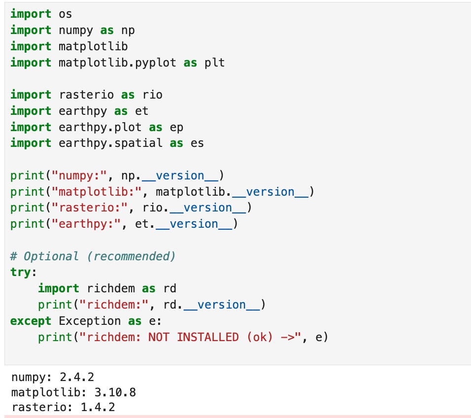
1. Successful imports + package versions (rasterio, earthpy, richdem, etc.).
Description...
import os

import earthpy as et

# Downloads sample data to earth_analytics directory
data_dir = et.data.get_data("vignette-elevation")

# The ex. DEM file (pre_DTM.tif) lives inside that folder
dem_path = os.path.join(data_dir, "pre_DTM.tif")
print(dem_path)import os
import earthpy as et
import earthpy.plot as ep
import earthpy.spatial as es
import matplotlib
import matplotlib.pyplot as plt
import numpy as np
import rasterio as rio
print("numpy:", np.__version__)
print("matplotlib:", matplotlib.__version__)
print("rasterio:", rio.__version__)
print("earthpy:", et.__version__)
# Optional (recommended)
try:
import richdem as rd
print("richdem:", rd.__version__)
except Exception as e:
print("richdem: NOT INSTALLED (ok) ->", e)DEM_PATH = "/Users/bhoconnor/earth-analytics/data/vignette-elevation/pre_DTM.tif" # <-- set from Option B above
with rio.open(DEM_PATH) as src:
dem = src.read(1).astype("float32")
profile = src.profile
crs = src.crs
transform = src.transform
nodata = src.nodata
print("CRS:", crs)
print("Shape (rows, cols):", dem.shape)
print("Resolution:", (transform.a, -transform.e))
print("Nodata:", nodata)
# Mask nodata (and any other invalid values you decide)
if nodata is not None:
dem[dem == nodata] = np.nan
print("Min/Max (masked):", np.nanmin(dem), np.nanmax(dem))# Simple DEM plot (EarthPy helper)
ep.plot_bands(
dem,
cmap="cividis", # try: "gist_earth", "viridis", "cividis", "terrain"
title="DEM (Elevation)",
figsize=(10, 6),
)
plt.show()# Percentile stretch (2nd-98th is a common starting point)
vmin, vmax = np.nanpercentile(dem, (2, 98))
ep.plot_bands(
dem,
cmap="cividis",
vmin=vmin,
vmax=vmax,
title=f"DEM (2-98% stretch): vmin={vmin:.1f}, vmax={vmax:.1f}",
figsize=(10, 6),
)
plt.show()# histogram to justify stretch
vals = dem[np.isfinite(dem)]
plt.figure(figsize=(8, 4))
plt.hist(vals, bins=60)
plt.title("Elevation histogram (masked)")
plt.xlabel("Elevation")
plt.ylabel("Pixel count")
plt.show()# Requires: conda install -c conda-forge richdem
import richdem as rd
# Load DEM with georeferencing (best practice)
# dem_rd = rd.LoadGDAL(DEM_PATH) this one is not working for some reason
dem_rd = rd.rdarray(dem, no_data=nodata)
# Slope options:
# - 'slope_degrees' (0-90) is easy to interpret
# - 'slope_riserun' (rise/run) can be converted to percent slope
slope_deg = rd.TerrainAttribute(dem_rd, attrib="slope_degrees")
# Aspect is a circular direction (0-360 degrees, often 0/360 = North)
aspect = rd.TerrainAttribute(dem_rd, attrib="aspect")# Slope
ep.plot_bands(
np.array(slope_deg),
cmap="magma",
title="Slope (degrees)",
figsize=(10, 6),
)
plt.show()
# Aspect (use a cyclic colormap if available)
ep.plot_bands(
np.array(aspect),
cmap="twilight", # try: "hsv" if twilight is not available
title="Aspect (degrees, cyclic)",
figsize=(10, 6),
)
plt.show()# EarthPy hillshade from the DEM array
# azimuth: 0=N, 90=E, 180=S, 270=W (default often ~315)
# altitude: 0-90 (higher = less shadow)
azimuth = 315
altitude = 45
hill = es.hillshade(dem, azimuth=azimuth, altitude=altitude)
ep.plot_bands(
hill,
cmap="Greys",
cbar=False,
title=f"Hillshade (azimuth={azimuth}, altitude={altitude})",
figsize=(10, 6),
)
plt.show()# (Optional) Compare multiple hillshades
# Compare 4 lighting settings (small multiples)
settings = [(315, 45), (45, 45), (315, 25), (315, 70)]
fig, axes = plt.subplots(2, 2, figsize=(12, 9))
axes = axes.ravel()
for ax, (az, alt) in zip(axes, settings):
hs = es.hillshade(dem, azimuth=az, altitude=alt)
ax.imshow(hs, cmap="Greys")
ax.set_title(f"az={az}, alt={alt}")
ax.set_axis_off()
plt.tight_layout()
plt.show()# 1) Plot the DEM as the base (color)
fig, ax = plt.subplots(figsize=(10, 6))
ep.plot_bands(
dem,
ax=ax,
cmap="terrain",
title="DEM + hillshade overlay",
cbar=True,
)
# 2) Overlay hillshade (grayscale) with transparency
ax.imshow(
hill,
cmap="Greys",
alpha=0.4, # can try alpha: 0.2 -> 0.6 (higher # = more shadows); can also change "Greys" to:
# "gist_yarg" (Inverted gray (White-to-black), if underlying map is very dark.
# "binary" High contrast black/white. Good for artistic, "ink-drawn" looking maps.
# "copper" Black to metallic bronze. Gives the terrain a "vintage" or sun-baked look.
)
ax.set_axis_off()
plt.show()# Save at high resolution for reports / portfolio
out_png = "outputs/dem_hillshade.png"
os.makedirs("outputs", exist_ok=True)
fig.savefig(out_png, dpi=300, bbox_inches="tight")
print("Saved:", out_png)# Write GeoTIFFs with rasterio (keeps CRS, transform, etc.)
os.makedirs("outputs", exist_ok=True)
def write_tif(path, arr, profile):
prof = profile.copy()
prof.update(dtype="float32", count=1, nodata=np.nan)
with rio.open(path, "w", **prof) as dst:
dst.write(arr.astype("float32"), 1)
write_tif("outputs/slope_degrees.tif", np.array(slope_deg), profile)
write_tif("outputs/aspect_degrees.tif", np.array(aspect), profile)
write_tif("outputs/hillshade.tif", hill.astype("float32"), profile)
print("Wrote GeoTIFFs to outputs/")
2. Raster inspection output: CRS, shape, resolution, nodata value, min/max (after masking).
Description...

3a. DEM plot with 1st colormap, terrain (shows chosen vmin/vmax or percentile stretch).
Description...

3b. DEM plot with 1st colormap, gist_earth (shows chosen vmin/vmax or percentile stretch).
Description...

3c. DEM plot with 1st colormap, cividis (shows chosen vmin/vmax or percentile stretch).
Description...

4. Slope plot + aspect plot (including what units used, degrees).
Description...

5. Hillshade plot (includes azimuth + altitude).
Description...

6. DEM + hillshade composite plot (and the alpha / blending choice).
Description...

Answers to coding Q's (1 of 2)
Description...

Answers to coding Q's (2 of 2)
Description...
Week 8
💻 Lab 7

1. Successful imports + package versions (geopandas, networkx; osmnx if used)
Description...
from pathlib import Pathfrom pathlib import Path
DATA = Path("data/raw")
OUT = Path("outputs")
FIG = OUT / "figs"
for p in [DATA, OUT, FIG]:
p.mkdir(parents=True, exist_ok=True)
print("Folders ready:", DATA, OUT, FIG)import urllib.request
from pathlib import Path
airports_url = (
"https://raw.githubusercontent.com/jpatokal/openflights/master/data/airports.dat"
)
routes_url = (
"https://raw.githubusercontent.com/jpatokal/openflights/master/data/routes.dat"
)
airports_path = Path("data/raw/airports.dat")
routes_path = Path("data/raw/routes.dat")
urllib.request.urlretrieve(airports_url, airports_path)
urllib.request.urlretrieve(routes_url, routes_path)
print("Downloaded:", airports_path, routes_path)pwdcd / Users / bhoconnor / Documents / GitHub / Lab_data / lab7_datapwdimport pandas as pd
airports_cols = (
"airport_id,name,city,country,iata,icao,lat,lon,alt,tz,dst,tz_db,type,source".split(
","
)
)
routes_cols = "airline,airline_id,src_iata,src_id,dst_iata,dst_id,codeshare,stops,equipment".split(
","
)
airports = pd.read_csv("data/raw/airports.dat", header=None, names=airports_cols)
routes = pd.read_csv("data/raw/routes.dat", header=None, names=routes_cols)
print("airports:", airports.shape, "routes:", routes.shape)
print(airports[["iata", "name", "country", "lat", "lon"]].head())
print(routes[["src_iata", "dst_iata", "stops"]].head())import networkx as nx
# Clean (OpenFlights uses literal string "\N" for missing codes)
for c in ["src_iata", "dst_iata"]:
routes[c] = routes[c].astype(str)
mask = (
routes["src_iata"].notna()
& routes["dst_iata"].notna()
& (routes["src_iata"] != r"\N")
& (routes["dst_iata"] != r"\N")
& (routes["src_iata"].str.len() > 0)
& (routes["dst_iata"].str.len() > 0)
)
routes2 = routes.loc[mask, ["src_iata", "dst_iata"]].copy()
routes2 = routes2[routes2["src_iata"] != routes2["dst_iata"]] # drop self-loops
# Aggregate to OD counts (edge weight)
od = (
routes2.groupby(["src_iata", "dst_iata"], as_index=False)
.size()
.rename(columns={"size": "flow"})
)
# Build weighted directed graph
G = nx.from_pandas_edgelist(
od,
source="src_iata",
target="dst_iata",
edge_attr="flow",
create_using=nx.DiGraph(),
)
print("Graph nodes:", G.number_of_nodes(), "edges:", G.number_of_edges())
# Keep a manageable subgraph for centrality (top N by degree)
deg = dict(G.degree())
top_nodes = sorted(deg, key=deg.get, reverse=True)[:200]
H = G.subgraph(top_nodes).copy()
print("Subgraph nodes:", H.number_of_nodes(), "edges:", H.number_of_edges())%whoimport matplotlib.pyplot as plt
pos = nx.spring_layout(H, seed=7, k=0.55)
# ── Visual design knobs (try changing these) ──────────────────────
node_size_scale = 30 # larger = bigger nodes
edge_width_scale = 0.20 # larger = thicker edges
node_alpha = 0.80 # lower = more transparent
edge_alpha = 0.30 # lower = more transparent
bg_color = "white" # dark background = "plasma"; try "white" for print
node_cmap = "cool" # try "viridis", "cool", "YlOrRd"
edge_color = "gray" # try "white" or "gray"
# ─────────────────────────────────────────────────────────────────
deg_H = dict(H.degree())
node_sizes = [deg_H[n] * node_size_scale for n in H.nodes()]
node_colors = [deg_H[n] for n in H.nodes()] # color encodes degree
edge_widths = [H[u][v]["flow"] * edge_width_scale for u, v in H.edges()]
fig, ax = plt.subplots(figsize=(11, 9), facecolor=bg_color)
ax.set_facecolor(bg_color)
nx.draw_networkx_edges(
H, pos, ax=ax, width=edge_widths, alpha=edge_alpha, edge_color=edge_color
)
nc = nx.draw_networkx_nodes(
H,
pos,
ax=ax,
node_size=node_sizes,
node_color=node_colors,
cmap=node_cmap,
alpha=node_alpha,
)
sm = plt.cm.ScalarMappable(
cmap=node_cmap, norm=plt.Normalize(min(node_colors), max(node_colors))
)
plt.colorbar(sm, ax=ax, shrink=0.6, label="Degree", pad=0.01)
ax.set_title(
"OpenFlights network — node size & color = degree", color="black", fontsize=13
)
ax.axis("off")
out = "outputs/figs/network_nospatial.png"
plt.tight_layout()
plt.savefig(out, dpi=200, facecolor=bg_color)
plt.show()
print("Saved:", out)pwddeg_H = dict(H.degree())
top_deg_node = max(deg_H, key=deg_H.get)
# Betweenness (undirected for readability)
bw = nx.betweenness_centrality(H.to_undirected(), normalized=True)
top_bw_node = max(bw, key=bw.get)
print("Top degree node:", top_deg_node, "degree:", deg_H[top_deg_node])
print("Top betweenness node:", top_bw_node, "betweenness:", bw[top_bw_node])
# ── Visual design knobs ──────────────────────────────────────────────
bg = "#0f1117" # background color
color_deg = "#FFCE1B" # mustard yellow; was FF8C00 for orange — top degree node
color_bw = "#4CBB17" # kelly green; was FF00FF for magenta — top betweenness node
hl_node_size = 1800 # size of the two highlighted nodes
legend_ms = 10 # legend marker size (pts) — keep small!
# ─────────────────────────────────────────────────────────────────────
# TO DO (student exercise):
# 1. Change color_deg / color_bw to any hex color you prefer.
# 2. Try hl_node_size = 800 vs 2500 — how does it affect readability?
# 3. Change legend_ms (try 6–14) to control legend circle size.
# 4. Move the legend: loc='upper right', 'lower right', etc.
# ─────────────────────────────────────────────────────────────────────
# # SINCE TOP DEGREE & TOP BETWEENESS NODES = THE SAME...
# # Draw degree node larger (Yellow)
# nx.draw_networkx_nodes(H, pos, nodelist=[top_deg_node],
# node_size=hl_node_size + 500, node_color=color_deg)
# # Draw betweenness node slightly smaller (Green)
# nx.draw_networkx_nodes(H, pos, nodelist=[top_bw_node],
# node_size=hl_node_size, node_color=color_bw)
from matplotlib.lines import Line2D
fig, ax = plt.subplots(figsize=(11, 9), facecolor=bg)
ax.set_facecolor(bg)
nx.draw_networkx_edges(
H, pos, ax=ax, width=edge_widths, alpha=0.18, edge_color="#4a90d9"
)
nx.draw_networkx_nodes(
H, pos, ax=ax, node_size=node_sizes, node_color="gray", alpha=0.55
)
# Highlighted nodes — NO label here (would create oversized legend circles)
nx.draw_networkx_nodes(
H,
pos,
ax=ax,
nodelist=[top_deg_node],
node_size=hl_node_size,
node_color=color_deg,
linewidths=3,
edgecolors="white",
)
nx.draw_networkx_nodes(
H,
pos,
ax=ax,
nodelist=[top_bw_node],
node_size=hl_node_size,
node_color=color_bw,
linewidths=3,
edgecolors="white",
)
nx.draw_networkx_labels(
H,
pos,
ax=ax,
labels={top_deg_node: top_deg_node, top_bw_node: top_bw_node},
font_size=11,
font_color="white",
font_weight="bold",
)
# Build legend with small fixed-size markers (not inherited from node_size)
legend_handles = [
Line2D(
[0],
[0],
marker="o",
color="none",
markerfacecolor=color_deg,
markeredgecolor="white",
markeredgewidth=0.8,
markersize=legend_ms,
label=f"Top degree: {top_deg_node}",
),
Line2D(
[0],
[0],
marker="o",
color="none",
markerfacecolor=color_bw,
markeredgecolor="white",
markeredgewidth=0.8,
markersize=legend_ms,
label=f"Top betweenness: {top_bw_node}",
),
]
ax.legend(
handles=legend_handles,
loc="lower left",
fontsize=10,
facecolor="#222",
labelcolor="white",
framealpha=0.85,
borderpad=0.8,
)
ax.set_title(
"Highlighted: top degree (yellow) vs top betweenness (green)",
color="white",
fontsize=13,
)
ax.axis("off")
out = "outputs/figs/network_highlight.png"
plt.tight_layout()
plt.savefig(out, dpi=200, facecolor=bg)
plt.show()
print("Saved:", out)import os
import contextily as ctx
import matplotlib.pyplot as plt
import osmnx as ox
ox.settings.log_console = True
ox.settings.use_cache = True
ox.settings.timeout = 180
# Tip: Change PLACE to try a different city/region & changes map below (apparently can also change lat long below, maybe if city doesn't show?)
PLACE_CANDIDATES = [
"Concord, North Carolina, USA",
"New York City, New York, USA",
"Seattle, Washington, USA",
]
network_type = "drive"
# 1) Try place -> polygon, then fallback to point+radius
polygon = None
for place in PLACE_CANDIDATES:
try:
gdf_place = ox.geocode_to_gdf(place)
if len(gdf_place) > 0:
polygon = gdf_place.geometry.iloc[0]
print("Geocoded place OK:", place)
break
except Exception as e:
print("Geocode failed:", place, "|", type(e).__name__, e)
if polygon is not None:
G_road = ox.graph_from_polygon(polygon, network_type=network_type, simplify=True)
else:
print("Fallback: graph_from_point (no geocode results).")
# Example point (NYC-ish). Change as needed.
center_latlon = (40.7580, -73.9855)
dist_m = 3000
G_road = ox.graph_from_point(
center_latlon, dist=dist_m, network_type=network_type, simplify=True
)
# 2) Project + convert to GeoDataFrames
G_road = ox.project_graph(G_road)
nodes_gdf, edges_gdf = ox.graph_to_gdfs(G_road)
print("Road nodes:", nodes_gdf.shape, "Road edges:", edges_gdf.shape)
# 3) Plot + basemap (contextily wants Web Mercator)
edges_web = edges_gdf.to_crs(epsg=3857)
fig, ax = plt.subplots(figsize=(10, 8))
edges_web.plot(ax=ax, linewidth=0.6, alpha=0.8)
ctx.add_basemap(ax, crs=edges_web.crs)
ax.set_title("Road network (drive)")
ax.set_axis_off()
os.makedirs("outputs/figs", exist_ok=True)
out = "outputs/figs/road_network.png"
plt.tight_layout()
plt.savefig(out, dpi=200)
plt.show()
print("Saved:", out)import networkx as nx
import numpy as np
origin_latlon = ox.geocode(place) # (lat, lon)
orig_node = ox.nearest_nodes(G_road, X=origin_latlon[1], Y=origin_latlon[0])
print("Origin node:", orig_node)
hosp = ox.features_from_place(place, tags={"amenity": "hospital"}).to_crs(
nodes_gdf.crs
) # changed from "hosp" variable name & "hospital" amentity to bus stop, that & grocery didn't work
hosp_pts = hosp.geometry.centroid
target_nodes = [ox.nearest_nodes(G_road, X=p.x, Y=p.y) for p in hosp_pts]
dists = [
nx.shortest_path_length(G_road, orig_node, t, weight="length") for t in target_nodes
]
best_t = target_nodes[int(np.argmin(dists))]
print("Nearest hospital node:", best_t, "dist_m:", float(np.min(dists)))
route = nx.shortest_path(G_road, orig_node, best_t, weight="length")
route_gdf = ox.routing.route_to_gdf(G_road, route)
fig, ax = plt.subplots(figsize=(10, 8))
edges_gdf.plot(ax=ax, linewidth=0.8, alpha=0.8)
route_gdf.plot(ax=ax, linewidth=6) # change to around 6 to make path actually visible
ctx.add_basemap(ax, crs=edges_gdf.crs)
ax.set_title("Accessibility demo: Shortest path to nearest hospital, Concord, NC")
ax.set_axis_off()
out = "outputs/figs/accessibility.png"
plt.tight_layout()
plt.savefig(out, dpi=200)
plt.show()
print("Saved:", out)import os
import pandas as pd
# Clean airports table (OpenFlights uses literal string "\N")
air = airports[["iata", "lat", "lon", "name", "country"]].copy()
air["iata"] = air["iata"].astype(str)
mask = air["iata"].notna() & (air["iata"] != r"\N") & (air["iata"].str.len() > 0)
air = air.loc[mask].drop_duplicates("iata").copy()
air["lat"] = pd.to_numeric(air["lat"], errors="coerce")
air["lon"] = pd.to_numeric(air["lon"], errors="coerce")
# Join OD flows with origin/destination airport coordinates
od2 = od.merge(
air.add_prefix("o_"), left_on="src_iata", right_on="o_iata", how="left"
).merge(air.add_prefix("d_"), left_on="dst_iata", right_on="d_iata", how="left")
od2 = od2.dropna(subset=["o_lat", "o_lon", "d_lat", "d_lon"]).copy()
print("OD rows after join:", od2.shape)
os.makedirs("outputs", exist_ok=True)
out_csv = "outputs/od_flows.csv"
od2.to_csv(out_csv, index=False)
print("Saved:", out_csv)import matplotlib.pyplot as plt
import numpy as np
df = od2.copy()
print("df.shape:", df.shape)
print(df.dtypes)
print(df.isnull().sum())
print(df["flow"].describe())
plt.figure(figsize=(6, 4))
plt.hist(df["flow"], bins=50)
plt.title("Flow distribution (raw)")
plt.tight_layout()
plt.show()
plt.figure(figsize=(6, 4))
plt.hist(np.log1p(df["flow"]), bins=50)
plt.title("Flow distribution (log1p)")
plt.tight_layout()
plt.show()
rev = df.rename(
columns={"src_iata": "dst_iata", "dst_iata": "src_iata", "flow": "flow_rev"}
)
sym = df.merge(
rev[["src_iata", "dst_iata", "flow_rev"]], on=["src_iata", "dst_iata"], how="left"
)
sym["diff"] = sym["flow"] - sym["flow_rev"].fillna(0)
print("Symmetry check (diff summary):")
print(sym["diff"].describe())
print(
"Unique origins:",
df["src_iata"].nunique(),
"Unique dests:",
df["dst_iata"].nunique(),
)
print(
"Lat range:",
(df["o_lat"].min(), df["o_lat"].max()),
"Lon range:",
(df["o_lon"].min(), df["o_lon"].max()),
)import contextily as ctx
import geopandas as gpd
import matplotlib.colors as mcolors
from shapely.geometry import LineString
N = 100 # change to reduce or increase flow rate
df_top = df.sort_values("flow", ascending=False).head(N).copy()
def curved_line(o_lon, o_lat, d_lon, d_lat, n_pts=40, bulge=0.15):
mid_lon = (o_lon + d_lon) / 2 + bulge * (d_lat - o_lat)
mid_lat = (o_lat + d_lat) / 2 - bulge * (d_lon - o_lon)
t = np.linspace(0, 1, n_pts)
lons = (1 - t) ** 2 * o_lon + 2 * (1 - t) * t * mid_lon + t**2 * d_lon
lats = (1 - t) ** 2 * o_lat + 2 * (1 - t) * t * mid_lat + t**2 * d_lat
return LineString(zip(lons, lats))
lines = [curved_line(r.o_lon, r.o_lat, r.d_lon, r.d_lat) for r in df_top.itertuples()]
gdf_lines = gpd.GeoDataFrame(df_top, geometry=lines, crs="EPSG:4326").to_crs(
"EPSG:3857"
)
# ── Visual design knobs ──────────────────────────────────────────────────
cmap_name = (
"YlOrRd" # try "plasma", "cool", "Blues", was originally "YlOrRd" (orange-ish)
)
alpha = 0.85
# ────────────────────────────────────────────────────────────────────────
log_flow = np.log1p(gdf_lines["flow"])
gdf_lines["w_plot"] = 0.3 + 5 * (log_flow - log_flow.min()) / (
log_flow.max() - log_flow.min()
)
cmap = plt.get_cmap(cmap_name)
norm = mcolors.LogNorm(vmin=gdf_lines["flow"].min() + 1, vmax=gdf_lines["flow"].max())
colors = [cmap(norm(f)) for f in gdf_lines["flow"]]
fig, ax = plt.subplots(figsize=(14, 8))
for (_, row), color in zip(gdf_lines.iterrows(), colors):
gpd.GeoDataFrame([row], geometry="geometry", crs=gdf_lines.crs).plot(
ax=ax, linewidth=row["w_plot"], alpha=alpha, color=color
)
sm = plt.cm.ScalarMappable(cmap=cmap, norm=norm)
plt.colorbar(sm, ax=ax, shrink=0.5, label="Flow (routes)", pad=0.01)
ctx.add_basemap(ax, crs=gdf_lines.crs, source=ctx.providers.CartoDB.DarkMatter)
ax.set_title(
f"OD flow map — top {N} flows (curved arcs, color = magnitude)", fontsize=13
)
ax.set_axis_off()
out = "outputs/figs/od_flow_map.png"
plt.tight_layout()
plt.savefig(out, dpi=200)
plt.show()
print("Saved:", out)# Option A: holoviews chord (interactive in Jupyter)
import holoviews as hv
import pandas as pd
from holoviews import opts
hv.extension("bokeh")
K = 5
topK = df.groupby("src_iata")["flow"].sum().sort_values(ascending=False).head(K).index
dfK = df[df["src_iata"].isin(topK) & df["dst_iata"].isin(topK)].copy()
edges = dfK[["src_iata", "dst_iata", "flow"]]
nodes = pd.DataFrame({"iata": sorted(set(edges["src_iata"]).union(edges["dst_iata"]))})
ch = hv.Chord((edges, hv.Dataset(nodes, "iata"))).opts(
opts.Chord(
labels="iata",
edge_color="src_iata",
node_color="iata",
edge_alpha=0.6,
node_size=10,
width=650,
height=650,
title=f"Chord diagram (top {K} airports)",
)
)
chimport seaborn as sns
K = 25
topK = df.groupby("src_iata")["flow"].sum().sort_values(ascending=False).head(K).index
dfK = df[df["src_iata"].isin(topK) & df["dst_iata"].isin(topK)].copy()
mat = dfK.pivot_table(
index="src_iata", columns="dst_iata", values="flow", aggfunc="sum", fill_value=0
).reindex(index=topK, columns=topK, fill_value=0)
# ── Visual design knobs ──────────────────────────────────────────────────
cmap_name = "YlOrRd" # try "YlOrRd", "Blues", "RdYlGn_r", was originally "magma"
use_log = True # log-transform to reveal structure in heavy tails
# ────────────────────────────────────────────────────────────────────────
mat_plot = np.log1p(mat) if use_log else mat
cb_label = "log(1+flow)" if use_log else "flow"
fig, ax = plt.subplots(figsize=(11, 9))
sns.heatmap(
mat_plot,
ax=ax,
cmap=cmap_name,
linewidths=0.3,
linecolor="gray",
square=True,
xticklabels=True,
yticklabels=True,
cbar_kws={"label": cb_label, "shrink": 0.75},
)
ax.set_title(f"OD matrix — top {K} airports by total flow", fontsize=14)
ax.set_xlabel("Destination IATA", fontsize=11)
ax.set_ylabel("Origin IATA", fontsize=11)
ax.tick_params(axis="x", rotation=90, labelsize=8)
ax.tick_params(axis="y", rotation=0, labelsize=8)
out = "outputs/figs/od_matrix.png"
plt.tight_layout()
plt.savefig(out, dpi=200)
plt.show()
print("Saved:", out)import io
import os
from pathlib import Path
import geopandas as gpd
import networkx as nx
import numpy as np
import pandas as pd
import requests
from shapely.geometry import LineString, Point
# ──────────────────────────────────────────────────────────────────────────
# Road-following synthetic GPS trajectories WITH stop events
# ──────────────────────────────────────────────────────────────────────────
# REQUIRES: G_road, nodes_gdf, edges_gdf from Section 1.7.
# ──────────────────────────────────────────────────────────────────────────
rng = np.random.default_rng(42)
N_TRAJ = 6 # number of synthetic vehicle trajectories
PING_INTERVAL_S = 15 # nominal GPS ping interval (seconds)
GPS_NOISE_M = 8 # +/-8 m GPS noise
GAP_PROB = 0.08 # fraction of pings randomly dropped
STOP_PROB = 0.50 # prob of stopping at each intersection node
MIN_STOPS = 2 # guarantee at least this many stops per route
STOP_DUR_RANGE = (45, 150) # stop duration range in seconds
def sample_route_pings(
G,
nodes_gdf,
src,
dst,
ping_s,
noise_m,
gap_p,
stop_p,
min_s,
stop_dur,
rng,
tid,
base_t,
):
try:
path_nodes = nx.shortest_path(G, src, dst, weight="length")
except nx.NetworkXNoPath:
return []
if len(path_nodes) < 3:
return []
# Build full polyline and record cumulative dist at each intermediate node
coords = []
node_dists = [0.0]
cumlen = 0.0
for u, v in zip(path_nodes[:-1], path_nodes[1:]):
ed = G[u][v]
if isinstance(ed, dict) and 0 in ed:
ed = ed[0]
geom = ed.get("geometry", None)
if geom is not None:
seg = list(geom.coords)
coords.extend(seg)
cumlen += LineString(seg).length
else:
p1 = (nodes_gdf.loc[u].geometry.x, nodes_gdf.loc[u].geometry.y)
p2 = (nodes_gdf.loc[v].geometry.x, nodes_gdf.loc[v].geometry.y)
coords.extend([p1, p2])
cumlen += np.hypot(p2[0] - p1[0], p2[1] - p1[1])
node_dists.append(cumlen)
route_line = LineString(coords)
total_len = route_line.length
mid_dists = node_dists[1:-1] # intermediate nodes only
# Stochastic stop selection, then guarantee MIN_STOPS
stop_mask = [rng.random() < stop_p for _ in mid_dists]
if mid_dists and sum(stop_mask) < min_s:
# force-enable random nodes until we reach MIN_STOPS
off_idx = [i for i, m in enumerate(stop_mask) if not m]
rng.shuffle(off_idx)
for i in off_idx[: max(0, min_s - sum(stop_mask))]:
stop_mask[i] = True
stop_events = {
mid_dists[i]: int(rng.integers(stop_dur[0], stop_dur[1]))
for i, m in enumerate(stop_mask)
if m
}
speed_ms = rng.uniform(15, 30) / 3.6
step = speed_ms * ping_s
rows = []
dist = 0.0
t_sec = 0.0
fired = set() # avoid firing the same stop twice
while dist < total_len:
# Inject stop if within half a step of a stop node
for stop_dist, stop_secs in stop_events.items():
if stop_dist not in fired and abs(dist - stop_dist) < step * 0.55:
fired.add(stop_dist)
n_sp = max(1, stop_secs // ping_s)
pt_s = route_line.interpolate(stop_dist)
gs_s = gpd.GeoSeries([pt_s], crs=nodes_gdf.crs).to_crs("EPSG:4326")
slon0, slat0 = gs_s.iloc[0].x, gs_s.iloc[0].y
nd = noise_m * 1e-5
for _ in range(n_sp):
if rng.random() > gap_p:
t = base_t + pd.Timedelta(seconds=t_sec)
rows.append(
(
f"T{tid:02d}",
t,
slat0 + rng.normal(0, nd * 0.15),
slon0 + rng.normal(0, nd * 0.15),
)
)
t_sec += ping_s
break
# Normal moving ping
pt = route_line.interpolate(dist)
gs = gpd.GeoSeries([pt], crs=nodes_gdf.crs).to_crs("EPSG:4326")
lon0, lat0 = gs.iloc[0].x, gs.iloc[0].y
nd = noise_m * 1e-5
if rng.random() > gap_p:
t = base_t + pd.Timedelta(seconds=t_sec)
rows.append(
(f"T{tid:02d}", t, lat0 + rng.normal(0, nd), lon0 + rng.normal(0, nd))
)
dist += step
t_sec += ping_s + int(rng.integers(0, 5))
return rows
all_nodes = list(G_road.nodes())
rows_all = []
base_t = pd.Timestamp("2024-06-15 08:00:00")
for tid in range(N_TRAJ):
for _ in range(60):
src, dst = rng.choice(all_nodes, size=2, replace=False)
try:
plen = nx.shortest_path_length(G_road, src, dst, weight="length")
except nx.NetworkXNoPath:
continue
if plen > 500:
break
offset = pd.Timedelta(minutes=int(rng.integers(0, 20)))
rows_all.extend(
sample_route_pings(
G_road,
nodes_gdf,
src,
dst,
PING_INTERVAL_S,
GPS_NOISE_M,
GAP_PROB,
STOP_PROB,
MIN_STOPS,
STOP_DUR_RANGE,
rng,
tid,
base_t + offset,
)
)
df = pd.DataFrame(rows_all, columns=["traj_id", "t", "lat", "lon"])
print(f'Generated {df["traj_id"].nunique()} trajectories, {len(df)} pings')
print(
f" noise: {GPS_NOISE_M}m | interval: {PING_INTERVAL_S}s |",
f"gap: {GAP_PROB:.0%} | stop_prob: {STOP_PROB:.0%} | min_stops: {MIN_STOPS}",
)
df.head()
import geopandas as gpd
# df is your road-following GPS ping table for the rest of Part 3
df_traj = df.copy()
df_traj["t"] = pd.to_datetime(df_traj["t"])
print(df_traj.head())
print("traj_id unique:", df_traj["traj_id"].nunique())
print("rows:", df_traj.shape[0])import numpy as np
df_traj = df_traj.sort_values(["traj_id", "t"]).copy()
df_traj["dt_s"] = df_traj.groupby("traj_id")["t"].diff().dt.total_seconds()
print("Temporal gaps (seconds) summary:")
print(df_traj["dt_s"].describe())
def haversine_m(lon1, lat1, lon2, lat2):
R = 6371000
lon1, lat1, lon2, lat2 = map(np.radians, [lon1, lat1, lon2, lat2])
dlon = lon2 - lon1
dlat = lat2 - lat1
a = np.sin(dlat / 2) ** 2 + np.cos(lat1) * np.cos(lat2) * np.sin(dlon / 2) ** 2
return 2 * R * np.arcsin(np.sqrt(a))
df_traj["lon_prev"] = df_traj.groupby("traj_id")["lon"].shift()
df_traj["lat_prev"] = df_traj.groupby("traj_id")["lat"].shift()
df_traj["dist_m"] = haversine_m(
df_traj["lon_prev"], df_traj["lat_prev"], df_traj["lon"], df_traj["lat"]
)
df_traj["speed_kmh"] = (df_traj["dist_m"] / df_traj["dt_s"]) * 3.6
print("Speed (km/h) summary:")
print(df_traj["speed_kmh"].describe())
by = df_traj.groupby("traj_id").agg(
n_points=("t", "size"),
duration_min=("dt_s", lambda s: np.nansum(s) / 60),
dist_km=("dist_m", lambda s: np.nansum(s) / 1000),
)
print(by.describe())
print("Lat range:", (df_traj["lat"].min(), df_traj["lat"].max()))
print("Lon range:", (df_traj["lon"].min(), df_traj["lon"].max()))import geopandas as gpd
from shapely.geometry import Point, LineString
import contextily as ctx
import matplotlib.patches as mpatches
import matplotlib.pyplot as plt
import osmnx as ox
one_id = df_traj["traj_id"].iloc[0]
t0 = df_traj[df_traj["traj_id"] == one_id].copy()
gpts = gpd.GeoDataFrame(
t0,
geometry=[Point(xy) for xy in zip(t0.lon, t0.lat)],
crs="EPSG:4326"
).to_crs(edges_gdf.crs)
snapped_nodes = [ox.nearest_nodes(G_road, X=pt.x, Y=pt.y) for pt in gpts.geometry]
snapped_xy = [
(nodes_gdf.loc[n].geometry.x, nodes_gdf.loc[n].geometry.y)
for n in snapped_nodes
]
raw_line = LineString(list(gpts.geometry))
snap_line = LineString(snapped_xy)
graw = gpd.GeoSeries([raw_line], crs=edges_gdf.crs)
gsnap = gpd.GeoSeries([snap_line], crs=edges_gdf.crs)
# ── Side-by-side panels: same extent for direct comparison ──────────────
fig, axes = plt.subplots(1, 2, figsize=(16, 7), sharey=True)
for ax, gline, color, title in zip(
axes,
[graw, gsnap],
["#FF4136", "#2ECC40"], # red = raw, green = snapped
["Before map matching\n(raw GPS trace, may drift off road)", "After map matching\n(snapped to road network)"]
):
edges_gdf.plot(ax=ax, linewidth=0.5, alpha=0.45, color="#888")
gline.plot(ax=ax, linewidth=3.5, alpha=0.9, color=color)
if color == "#FF4136": # show GPS pings on "before" panel only
gpts.plot(ax=ax, markersize=5, color="orange", alpha=0.8, zorder=5)
ctx.add_basemap(ax, crs=edges_gdf.crs, source=ctx.providers.CartoDB.Positron)
ax.set_title(title, fontsize=12, pad=8)
ax.set_axis_off()
# Lock both panels to same extent (raw trace)
xmin, ymin, xmax, ymax = graw.total_bounds
pad = (xmax - xmin) * 0.15
ax.set_xlim(xmin - pad, xmax + pad)
ax.set_ylim(ymin - pad, ymax + pad)
patches = [
mpatches.Patch(color="#FF4136", label="Raw GPS path"),
mpatches.Patch(color="orange", label="GPS pings"),
mpatches.Patch(color="#2ECC40", label="Map-matched path"),
]
axes[1].legend(handles=patches, loc="lower right", fontsize=9)
fig.suptitle(
"Map matching — same trajectory, same map extent for direct comparison",
fontsize=13,
y=1.01
)
out = "outputs/figs/mapmatch_before_after.png"
plt.tight_layout()
plt.savefig(out, dpi=200, bbox_inches="tight")
plt.show()
print("Saved:", out)# Resample one trajectory to 10-second intervals (example)
t0i = t0.set_index("t").sort_index()
interval = "10s" # try 5S, 10S, 30S
t_rs = t0i.resample(interval).mean(numeric_only=True)
t_rs[["lat", "lon"]] = t_rs[["lat", "lon"]].interpolate()
t_rs = t_rs.reset_index()
print("Before rows:", t0i.shape[0], "After rows:", t_rs.shape[0])
# ── 2x2 panel: rug plots + gap-size histograms ───────────────────────────
fig, axes = plt.subplots(2, 2, figsize=(16, 8), gridspec_kw={"hspace": 0.45, "wspace": 0.3})
before_times = t0i.index.to_series()
gaps_before = before_times.diff().dt.total_seconds().dropna()
after_idx = pd.to_datetime(t_rs["t"])
gaps_after = after_idx.diff().dt.total_seconds().dropna()
# Top-left: ping timeline BEFORE
ax = axes[0, 0]
ax.vlines(before_times, 0, 1, lw=0.8, alpha=0.7, color="#E74C3C")
ax.set_title("Before: raw ping times (irregular spacing)", fontsize=11)
ax.set_xlabel("Time"); ax.set_yticks([])
ax.tick_params(axis="x", rotation=25)
# Top-right: ping timeline AFTER
ax = axes[0, 1]
ax.vlines(after_idx, 0, 1, lw=0.8, alpha=0.7, color="#27AE60")
ax.set_title(f"After: resampled at {interval} (uniform spacing)", fontsize=11)
ax.set_xlabel("Time"); ax.set_yticks([])
ax.tick_params(axis="x", rotation=25)
# Bottom-left: gap histogram BEFORE
ax = axes[1, 0]
ax.hist(gaps_before, bins=30, color="#E74C3C", alpha=0.85, edgecolor="white")
ax.axvline(gaps_before.median(), color="black", lw=1.5, ls="--", label=f"Median = {gaps_before.median():.0f}s")
ax.set_title("Gap-size distribution (before) — irregular gaps", fontsize=11)
ax.set_xlabel("Gap (seconds)"); ax.set_ylabel("Count")
ax.legend(fontsize=9)
# Bottom-right: gap histogram AFTER
ax = axes[1, 1]
ax.hist(gaps_after, bins=15, color="#27AE60", alpha=0.85, edgecolor="white")
ax.axvline(gaps_after.median(), color="black", lw=1.5, ls="--", label=f"Median = {gaps_after.median():.0f}s")
ax.set_title(f"Gap-size distribution (after, {interval}) — all gaps equal", fontsize=11)
ax.set_xlabel("Gap (seconds)"); ax.set_ylabel("Count")
ax.legend(fontsize=9)
fig.suptitle("Gap filling: temporal regularity before vs after resampling", fontsize=13, y=1.02)
out = "outputs/figs/gapfill_before_after.png"
plt.tight_layout()
plt.savefig(out, dpi=200, bbox_inches="tight")
plt.show()
print("Saved:", out)# 1) Trajectory line plot — segments colored by speed
# Save: outputs/figs/trajectory_line.png
from matplotlib.collections import LineCollection
import matplotlib.colors as mcolors
t0s = t0.sort_values("t").copy()
t0s["dt_s"] = t0s["t"].diff().dt.total_seconds()
t0s["lon_prev"] = t0s["lon"].shift()
t0s["lat_prev"] = t0s["lat"].shift()
t0s["dist_m"] = haversine_m(t0s["lon_prev"], t0s["lat_prev"], t0s["lon"], t0s["lat"])
t0s["speed_kmh"] = (t0s["dist_m"] / t0s["dt_s"]) * 3.6
t0s = t0s.dropna(subset=["speed_kmh"])
gpt_all = gpd.GeoDataFrame(
t0s,
geometry=[Point(xy) for xy in zip(t0s["lon"], t0s["lat"])],
crs="EPSG:4326"
).to_crs(edges_gdf.crs)
xs, ys = gpt_all.geometry.x.values, gpt_all.geometry.y.values
speeds = t0s["speed_kmh"].values
segments = [[(xs[i], ys[i]), (xs[i+1], ys[i+1])] for i in range(len(xs)-1)]
seg_speeds = speeds[1:]
# ── Visual design knobs ──────────────────────────────────────────────────
cmap_name = "RdYlGn_r" # red=fast, green=slow; try "plasma", "cool"
speed_vmax = np.percentile(seg_speeds, 95)
lw = 2.5
# ────────────────────────────────────────────────────────────────────────
cmap = plt.get_cmap(cmap_name)
norm = mcolors.Normalize(vmin=0, vmax=speed_vmax)
lc = LineCollection(
segments,
cmap=cmap,
norm=norm,
linewidth=lw,
alpha=0.92,
zorder=4
)
lc.set_array(seg_speeds)
fig, ax = plt.subplots(figsize=(10, 8))
edges_gdf.plot(ax=ax, linewidth=0.4, alpha=0.35, color="#aaa")
ax.add_collection(lc)
ax.autoscale()
plt.colorbar(lc, ax=ax, shrink=0.5, label="Speed (km/h)", pad=0.01)
ctx.add_basemap(ax, crs=edges_gdf.crs,
source=ctx.providers.CartoDB.Positron)
ax.set_title(
"Trajectory line plot — color encodes speed (green = slow, red = fast)")
ax.set_axis_off()
out = "outputs/figs/trajectory_line.png"
plt.tight_layout()
plt.savefig(out, dpi=200)
plt.show()
print("Saved:", out)# 2) Space-time cube (Plotly 3D) — trajectory tube colored by time
# Save: screenshot to outputs/figs/space_time_cube.png
import plotly.graph_objects as go
gpts_m = gpd.GeoDataFrame(
t0s,
geometry=[Point(xy) for xy in zip(t0s["lon"], t0s["lat"])],
crs="EPSG:4326"
).to_crs(edges_gdf.crs)
gpts_m["x"] = gpts_m.geometry.x
gpts_m["y"] = gpts_m.geometry.y
gpts_m["t_min"] = (
pd.to_datetime(gpts_m["t"]) - pd.to_datetime(gpts_m["t"]).min()
).dt.total_seconds() / 60
# ── Visual design knobs ──────────────────────────────────────────────────
colorscale = "Plasma" # try "Viridis", "Turbo", "RdYlGn", original was "Plasma"
line_width = 4
marker_size = 3
# ────────────────────────────────────────────────────────────────────────
fig = go.Figure()
fig.add_trace(go.Scatter3d(
x=gpts_m["x"],
y=gpts_m["y"],
z=gpts_m["t_min"],
mode="lines+markers",
line=dict(
width=line_width,
color=gpts_m["t_min"],
colorscale=colorscale
),
marker=dict(
size=marker_size,
color=gpts_m["t_min"],
colorscale=colorscale,
showscale=True,
colorbar=dict(title="Time (min)", thickness=15)
),
name="Trajectory"
))
bg = "#0f1117"
fig.update_layout(
title="Space-time cube — trajectory tube colored by elapsed time",
scene=dict(
xaxis_title="Easting (m)",
yaxis_title="Northing (m)",
zaxis_title="Time (minutes)",
bgcolor=bg,
xaxis=dict(backgroundcolor=bg, gridcolor="#333"),
yaxis=dict(backgroundcolor=bg, gridcolor="#333"),
zaxis=dict(backgroundcolor=bg, gridcolor="#333"),
),
paper_bgcolor=bg,
font=dict(color="white"),
margin=dict(l=0, r=0, b=0, t=40)
)
fig.show()# 3) Stop detection -- stops sized by duration, colored by speed
# Save: outputs/figs/stop_detection.png
import numpy as np
import pandas as pd
import geopandas as gpd
from shapely.geometry import Point
import mapclassify as mc
from matplotlib.lines import Line2D
import matplotlib.pyplot as plt
import contextily as ctx
# Assumes:
# - t0 has columns: ['t','lon','lat'] (and maybe others)
# - haversine_m(lon1, lat1, lon2, lat2) is defined
# - edges_gdf exists and has a projected CRS (e.g., EPSG:3857)
# - PING_INTERVAL_S is defined (fallback seconds for first point)
# - speed_thr is defined (km/h threshold)
# speed_thr defined
speed_thr = 5.0
# 1) Compute time delta, distance, speed
t0_speed = t0.sort_values("t").copy()
t0_speed["t"] = pd.to_datetime(t0_speed["t"], errors="coerce")
t0_speed["dt_s"] = t0_speed["t"].diff().dt.total_seconds()
t0_speed["lon_prev"] = t0_speed["lon"].shift()
t0_speed["lat_prev"] = t0_speed["lat"].shift()
t0_speed["dist_m"] = haversine_m(
t0_speed["lon_prev"], t0_speed["lat_prev"],
t0_speed["lon"], t0_speed["lat"]
)
t0_speed["speed_kmh"] = (t0_speed["dist_m"] / t0_speed["dt_s"].replace(0, np.nan)) * 3.6
# 2) Filter slow/stop points
slow_pts = t0_speed[
(t0_speed["speed_kmh"] < speed_thr) | (t0_speed["speed_kmh"].isna())
].copy()
# 3) Define stop duration per point (seconds)
slow_pts["stop_dur_s"] = slow_pts["dt_s"].fillna(PING_INTERVAL_S).clip(lower=0)
# 4) Create GeoDataFrame in WGS84 then project to match edges_gdf CRS
gslow = gpd.GeoDataFrame(
slow_pts,
geometry=gpd.points_from_xy(slow_pts["lon"], slow_pts["lat"]),
crs="EPSG:4326"
).to_crs(edges_gdf.crs)
print("gslow created:", gslow.shape)
print("CRS:", gslow.crs)
print(gslow[["t", "lon", "lat", "dt_s", "dist_m", "speed_kmh", "stop_dur_s"]].head())
# --- Create ONE figure/axes and keep using them ---
fig, ax = plt.subplots(figsize=(10, 8))
# background layers (example)
edges_gdf.plot(ax=ax, linewidth=0.4, alpha=0.35, color="#aaa")
gline_one = gpd.GeoSeries([raw_line], crs=edges_gdf.crs)
gline_one.plot(ax=ax, linewidth=2, alpha=0.4, color="#555", zorder=3)
if len(gslow) > 0:
# --- Jenks (Natural Breaks) on duration ---
dur = gslow["stop_dur_s"].to_numpy()
k = 4
k_eff = int(min(k, len(dur), len(np.unique(dur))))
k_eff = max(k_eff, 2)
nb = mc.NaturalBreaks(dur, k=k_eff)
gslow["dur_class"] = nb.yb
# --- Discrete sizes for classes (pt^2) ---
size_levels = np.array([60, 160, 320, 520, 760][:k_eff]) # stronger contrast
gslow["markersize"] = size_levels[gslow["dur_class"].values]
# --- Scatter ---
sc = ax.scatter(
gslow.geometry.x, gslow.geometry.y,
s=gslow["markersize"],
c=gslow["speed_kmh"].fillna(0),
cmap=cmap_name,
alpha=0.85, zorder=6,
vmin=0, vmax=speed_thr,
edgecolors="white", linewidths=0.6
)
# Attach colorbar
cb = fig.colorbar(sc, ax=ax, shrink=0.5, pad=0.01)
cb.set_label("Speed at stop (km/h)")
# --- Neat legend consistent with size_levels ---
bins_hi = nb.bins
bins_lo = np.r_[0, bins_hi[:-1]]
def fmt_seconds_range(a, b):
if b < 60:
return f"{int(a)}–{int(b)} s"
if a < 60 <= b:
return f"{int(a)} s – {int(round(b/60))} min"
return f"{int(round(a/60))}–{int(round(b/60))} min"
handles = []
for i in range(k_eff):
ms_pts = float(np.sqrt(size_levels[i])) # convert area -> points
label = fmt_seconds_range(bins_lo[i], bins_hi[i])
handles.append(
Line2D(
[0], [0], marker="o", linestyle="",
markersize=ms_pts,
markerfacecolor="#cc2200",
markeredgecolor="white",
markeredgewidth=0.8,
alpha=0.85,
label=label
)
)
ax.legend(
handles=handles,
title="Stop duration (Jenks classes)",
loc="lower left",
frameon=True,
framealpha=0.92,
borderpad=0.8,
labelspacing=0.7,
handletextpad=0.8,
fontsize=9,
title_fontsize=9
)
else:
ax.text(0.5, 0.5, "No stops detected", transform=ax.transAxes,
ha="center", va="center", fontsize=13, color="red")
# basemap + final formatting
ctx.add_basemap(ax, crs=edges_gdf.crs, source=ctx.providers.CartoDB.Positron)
ax.set_axis_off()
ax.set_title(f"Stop detection (speed < {speed_thr} km/h)\n"
"Circle size = duration class (Jenks) | Color = speed at stop")
out = "outputs/figs/stop_detection.png"
fig.tight_layout()
fig.savefig(out, dpi=200)
plt.show()
print("Saved:", out)
2. Non-spatial network: node/edge counts + top node by degree + top node by betweenness
Description...

3. Non-spatial network figure with highlighted nodes (degree + betweenness)
Description...

4. Road network download/preview (map)
Description...

5. Accessibility output (route map)
Description...

6a. OD checks: df.shape/dtypes + missing values + describe/hist + symmetry check + spatial coverage (1 of 2)
Description...

6b. OD checks: df.shape/dtypes + missing values + describe/hist + symmetry check + spatial coverage (2 of 2)
Description...

7. Flow map (OD) figure
Description...

8. Chord diagram (or documented fallback) figure
Description...

9. OD matrix heatmap figure
Description...

10. Trajectory checks: traj counts + temporal gaps + speed stats + length stats + spatial coverage
Description...

11. Map matching before / after figure
Description...

12. Gap filling before / after figure
Description...

13. Trajectory line plot on map figure
Description...

14. Space-time cube figure
Description...

15. Stop detection map figure
Description...
Title
Description...
Title
Description...
Week 9
💻 Labs & Exercises

Interactive Storytelling – Gemini Prompt Templates
For Lab 8
Interactive Maps
+ Add New Map Section
About Me
¡Hola!
Welcome to my Geo Visualization Portfolio...
Here is a little information about me:
What is my program at UNC Charlotte?
- Community Psychology (w/in the Health Psych. program)
What do I expect from my GEOG 8005 - Open-Source Geovisualization course?
- To learn some tools I can use to process and map social science data, even if I don’t pay for ArcGIS in the future (post-graduation)
Which tools or programming languages do I usually use for visualization?
- This can really depend, but some include ArcGIS, generic R, other R packages, SPSS, PowerPoint / Google Slide tools, Canva, etc.
What types of research or applications do I intend to use geovisualization for?
- Processing various social science data—eg, Census, social network data, neighborhood-level data, including housing, etc.